Duration
September 2025
Type
Academic Research, Responsive Website, Service Design
Tools
Figma, Mira, Google Ensuite, AI,
Partnered
They were drowning in paperwork, so I turned the chaos into a neat little system.


Problem Statement
Couples opting for court marriage in India face persistent, avoidable stress and confusion, not just due to paperwork and bureaucracy, but because the system fails to deliver clear, trustworthy, and supportive guidance (both online and in person) at every step, leaving applicants exposed to delays, repeat errors, privacy risks, and unpredictable experiences.
Understanding the Problem
In India, marriage registration involves multiple legal frameworks such as the Special Marriage Act, 1954, Hindu Marriage Act, 1955, Muslim Personal Law, and others, each with distinct processes and requirements.
The legal procedures often involve extensive paperwork, long waiting periods, public notice requirements, and coordination.
This procedure is intended to provide a simple, secular, and inclusive legal alternative to traditional ceremonies. In practice, couples face avoidable stress, confusion, delays, privacy risks, staff inconsistency, and untrustworthy guidance both online and in person. The experience is sometimes unpredictable and emotionally taxing for vulnerable users, especially in cases of interfaith, intercaste, or privacy-sensitive marriages.
In this section
Secondary Research
Competitor Analysis, Literature Review
Primary Research
Interviews, Survey, Persona, User Journey Map
Service Blueprint
Secondary Research
Theme 1: Legal Framework and Reform Studies
Legal Complexity: Multiple marriage laws in India cause confusion and limit accessibility.
Secular vs. Religious Clash: The Special Marriage Act conflicts with state anti-conversion laws, creating uncertainty.
Implementation Gap: Progressive provisions face hurdles from bureaucracy and social barriers.
Theme 2: Digital Government and Citizen Experience
User-Centered Design: Digital services work only when built around citizen needs.
Mobile-First: High mobile use drives better adoption of m-government solutions.
Beyond Digitization: Public services need structured experience design, not just process transfer online.
Theme 3: Technology and Innovation in Legal Services
AI for Efficiency: Machine learning can cut backlogs and boost judicial speed.
Adoption Barriers: Regulatory, cultural, and tech hurdles slow innovation in legal services.
Access & Equity: Digital transformation can expand justice access for marginalized groups.
Competitor Analysis
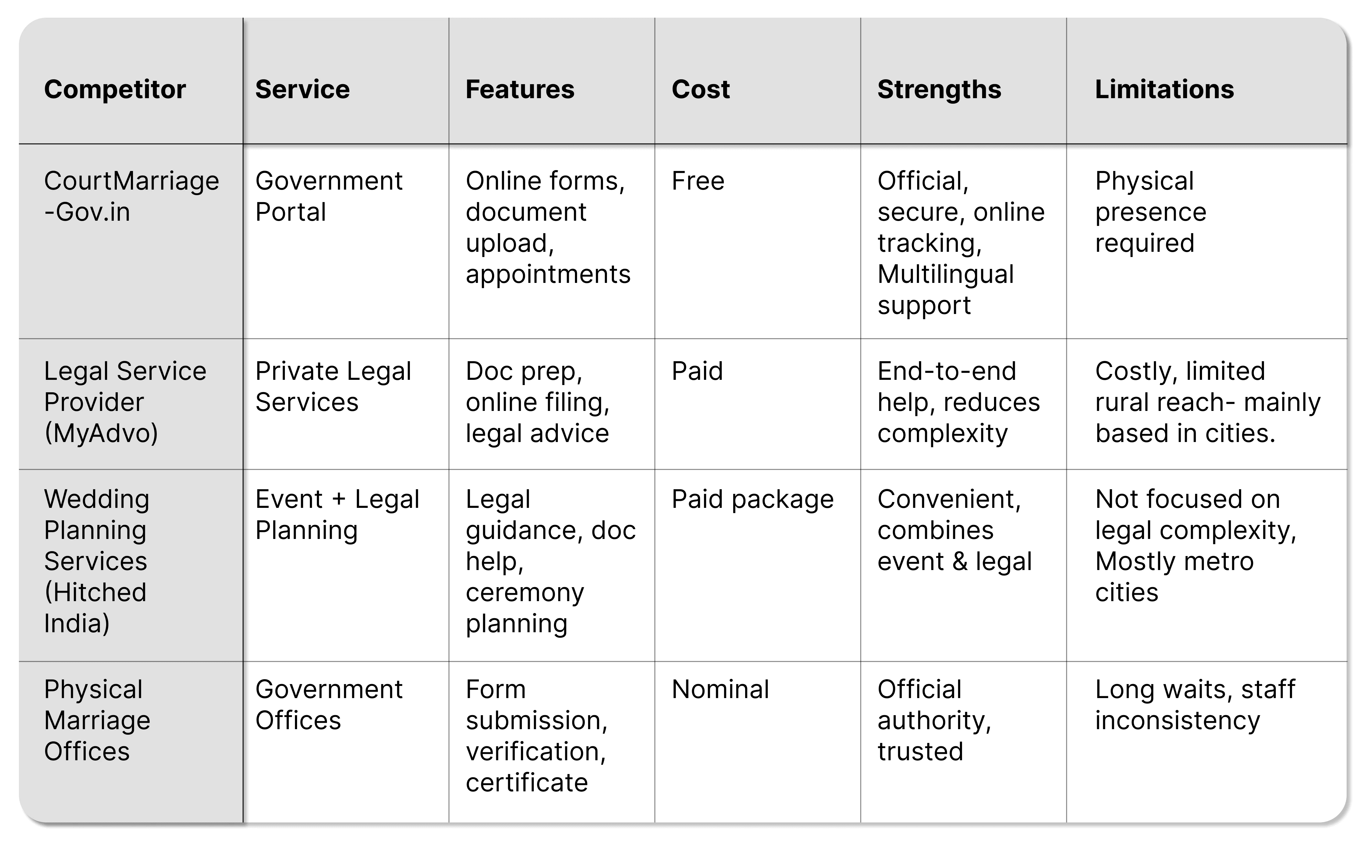
Google Reviews
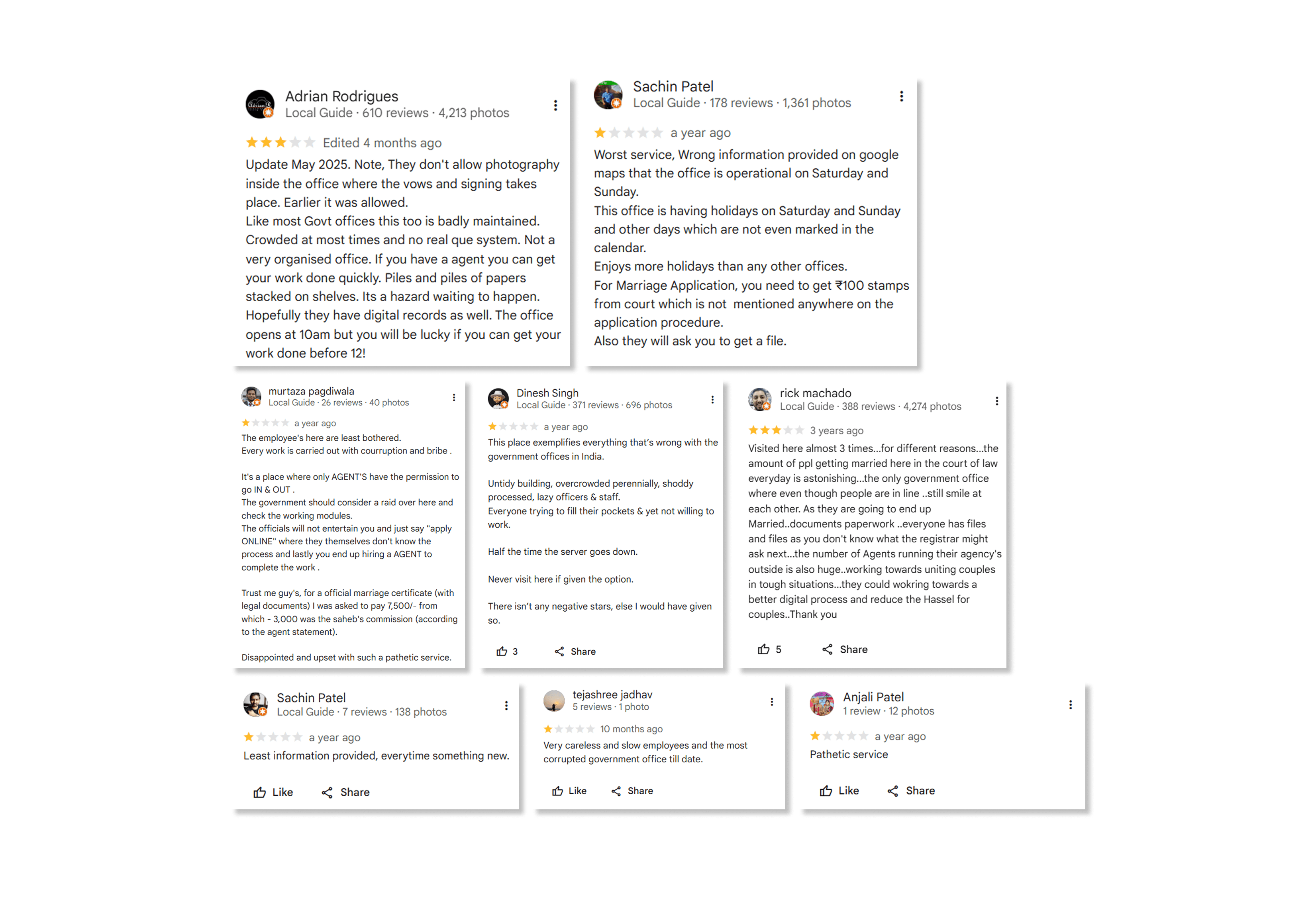
This leaves an experience which is filled with
somewhat clear instructions,
notice-period oversights,
complex paperwork,
unclear status updates,
long waiting lines,
staff unavailability and
bad service.
Primary Research
A survey form was circulated and 10 responses were collected via Google forms.
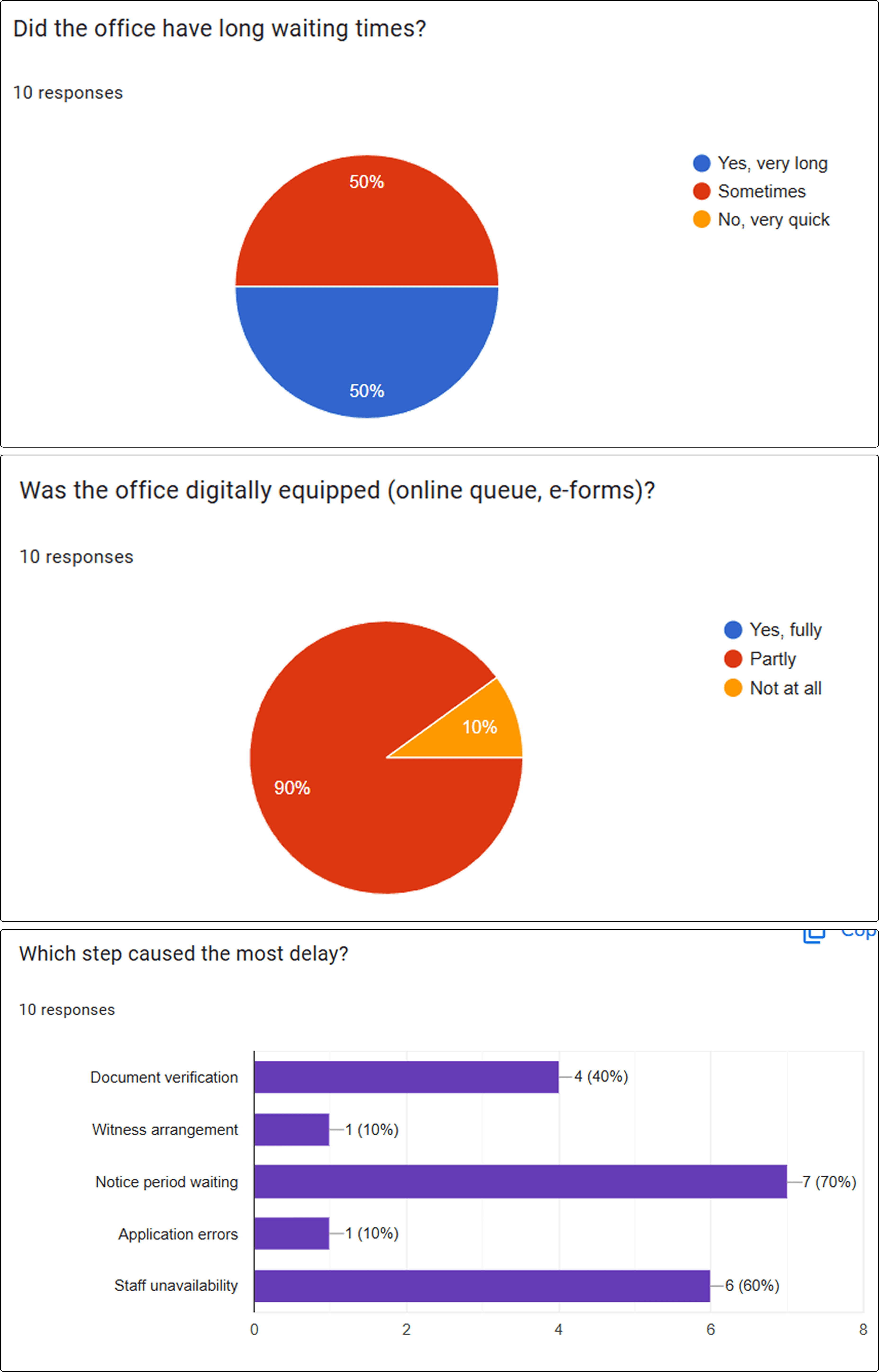
Interview Insights:
3 participants volunteered
to set interviews.
Users value clear stepwise guides and digital document upload to reduce confusion and visits.
Staff attitude and availability critically affected satisfaction level.
Waiting periods, especially during notice publication, and long queues created anxiety.
Many offices have partial digitalization; support kiosks and legal aid access would help.
Privacy concerns and objection handling require better communication and assistance.
Post-marriage processes (name change, certificate retrieval) need more support.
Multilingual digital/physical aids and empathetic staff training can transform experiences.
Design Statement
Design a phygital (physical + digital) platform that transforms the court marriage process in India into an accessible, error-proof, and privacy-respecting journey. The service simplifies documentation, enables status tracking, and integrates supportive physical touchpoints such as printed guides, consultation kiosks, and on-site document assistance, ensuring couples experience both digital convenience and the reassurance of human guidance.
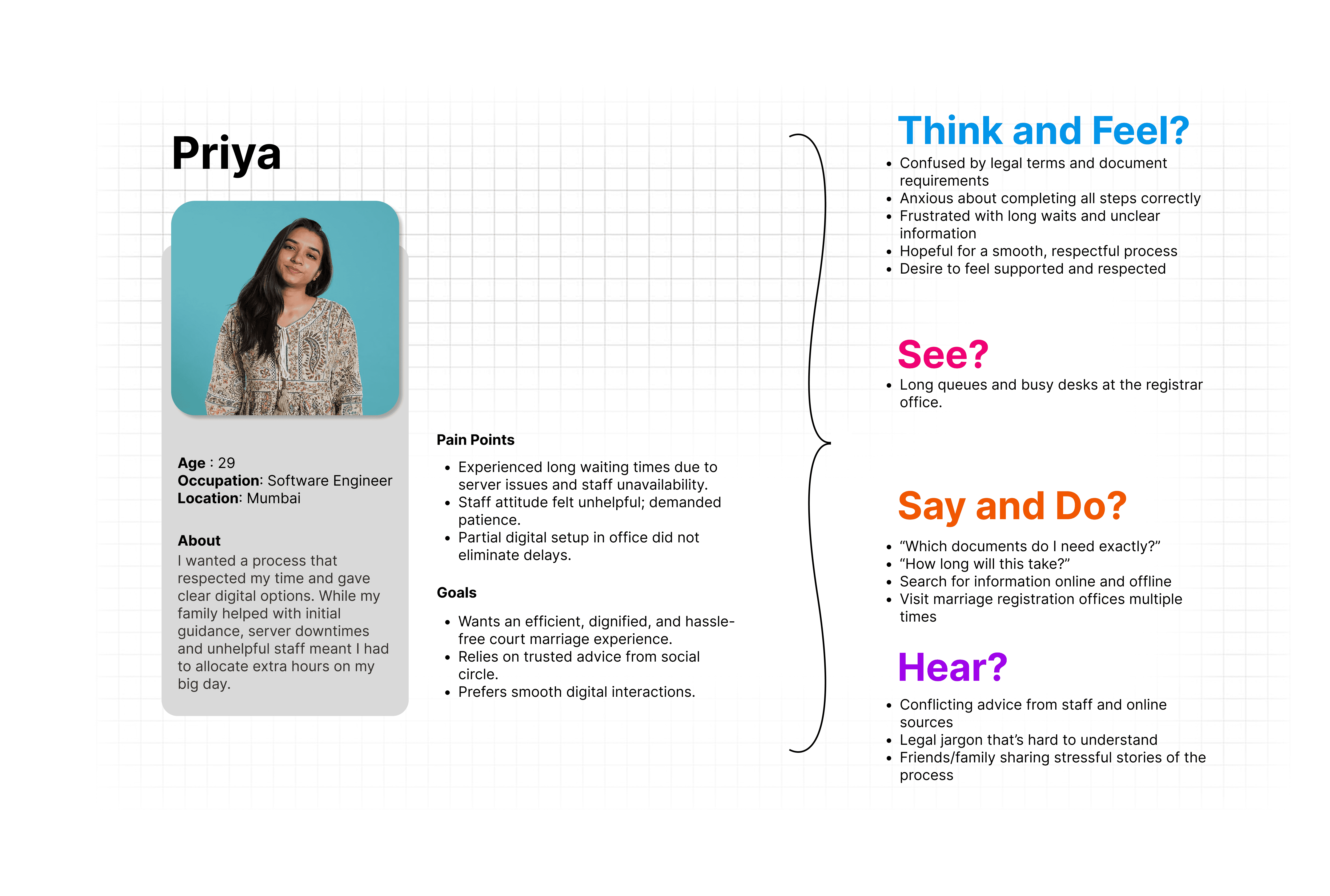
Building Persona
My user persona funneled all the information from survey and user interview responses by generating a user persona that I felt would be the best candidate to create a prototype for. The persona helped guide the project forward during the design and testing phases. Continually cross-referencing this document ensures my design meets the parameters for our outlined project brief.
Based on my user interviews I know two important findings:
Almost all users experienced very long waiting times and multiple visits to the office before successfully registering.
Found the process confusing and causing delays, especially with document verification and understanding requirements.
Persona
User Journey Map
Service Blueprint
In this section
User Flow and Task Analysis
Feature List
Information Architecture
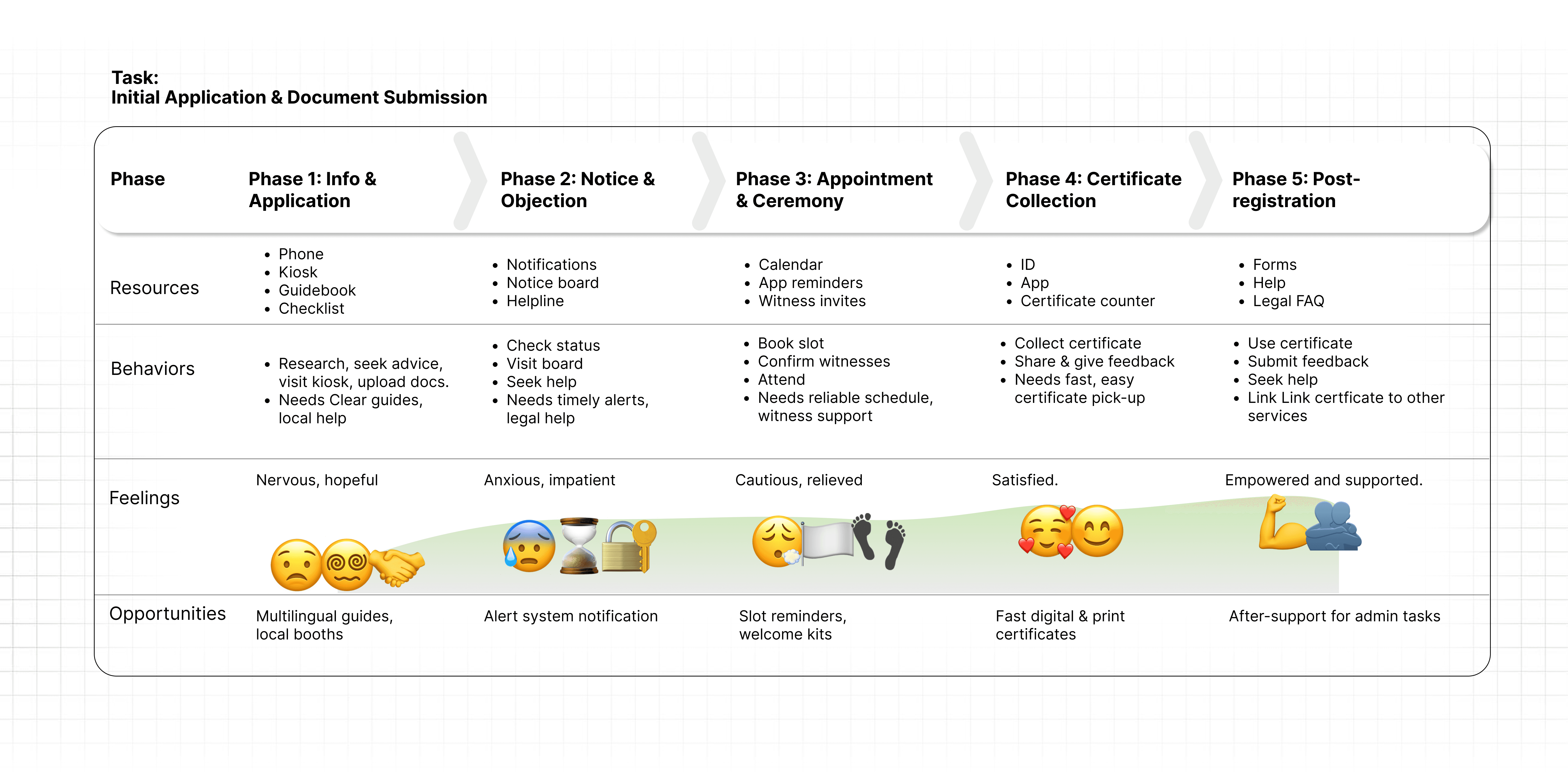
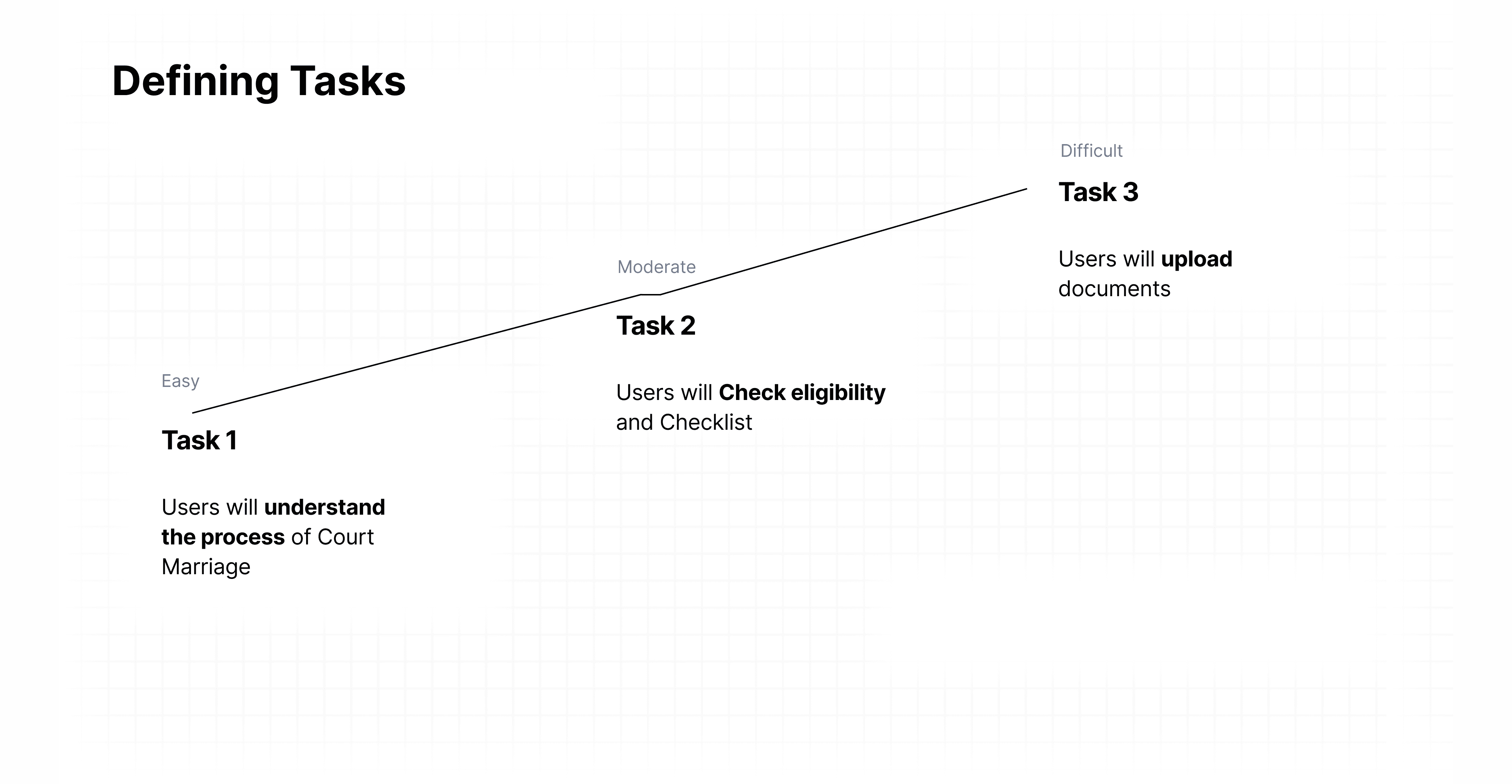
Tasks:
High-level task:
Complete court marriage registration.
Subtasks:
Create profile and input personal details.
Upload required documents.
Verify document compliance and completeness.
Submit application and pay fees.
Public notice publishing and notification receipt.
Monitor objection period and respond if needed.
Receive approval and schedule the ceremony.
Complete court ceremony formalities.
Obtain certified copies digitally and physically.
Task: Notice Submission & Verification
Feature List
Information Architecture
In this section
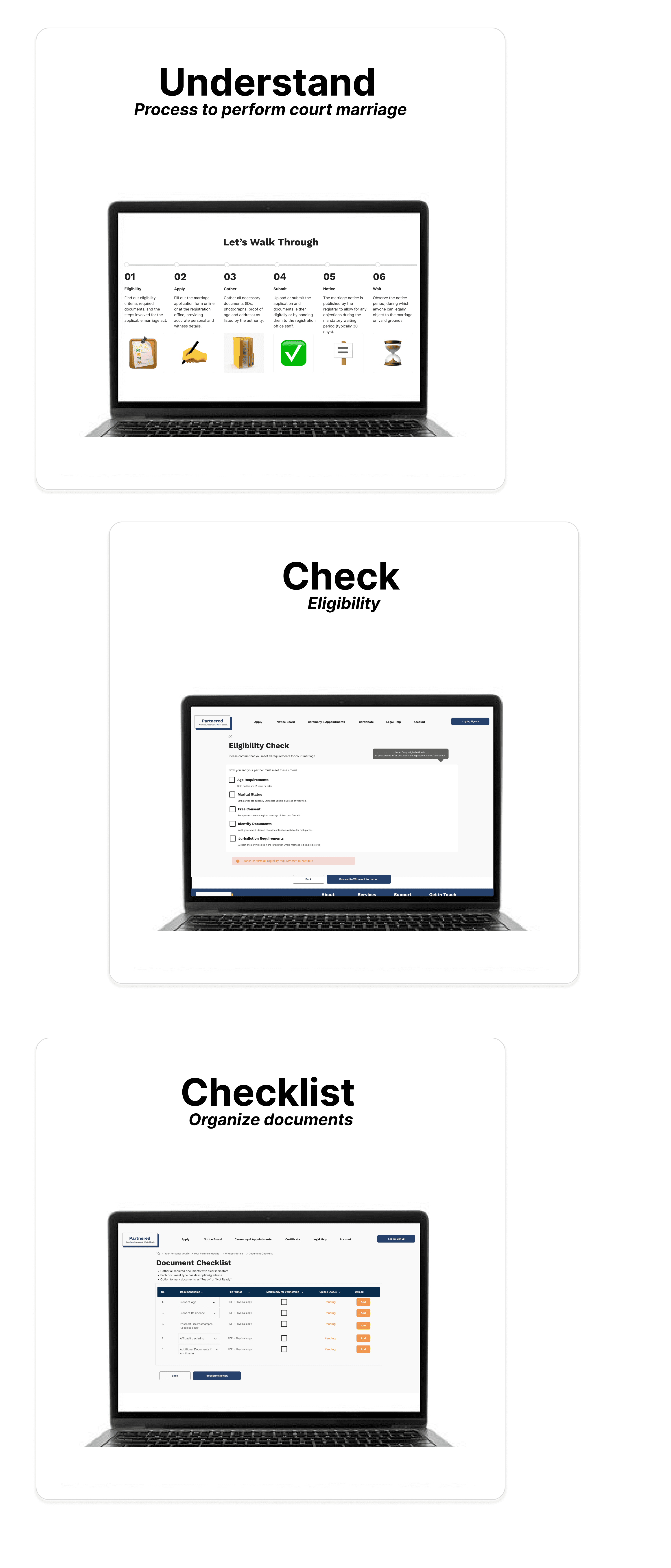
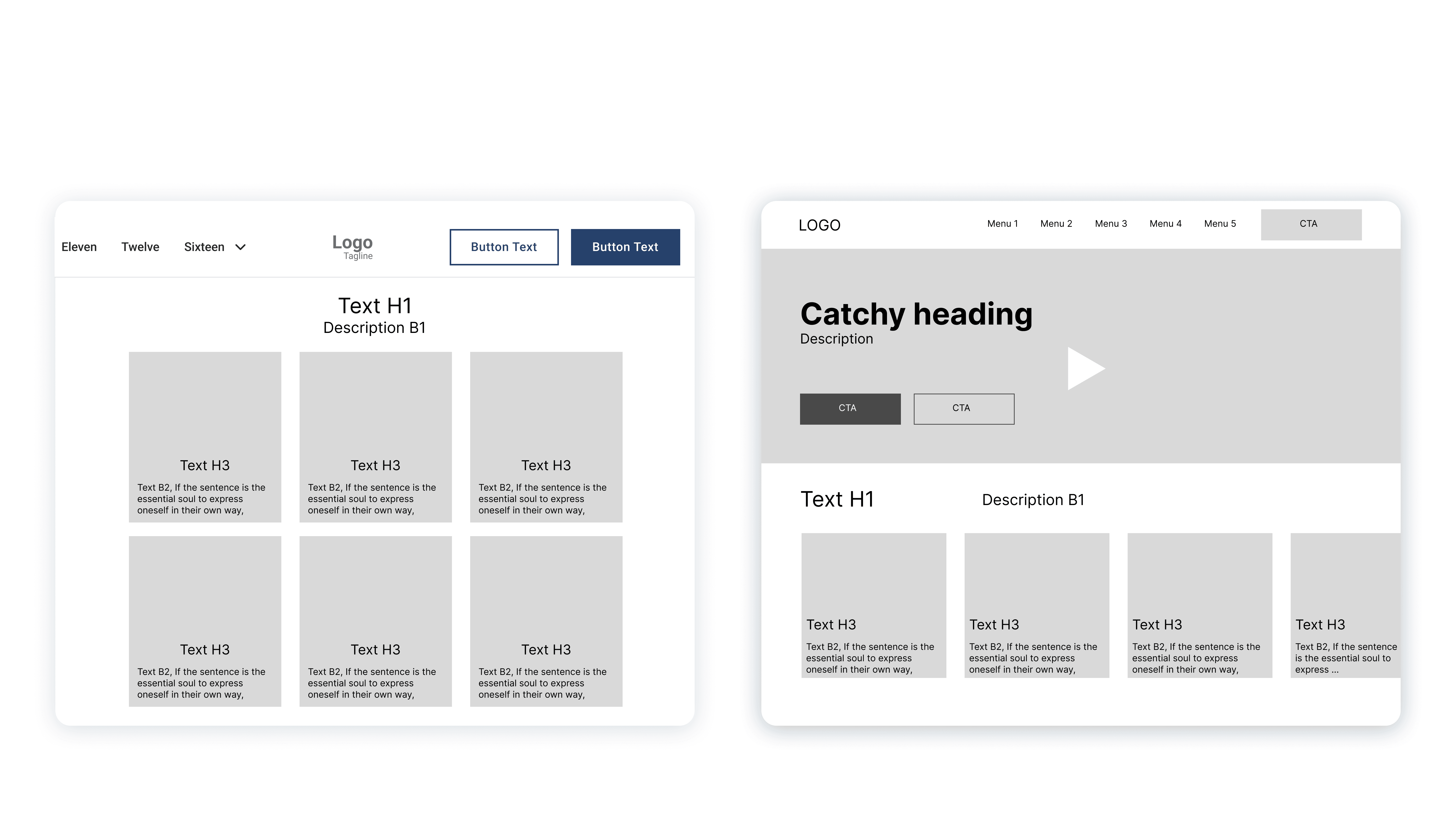
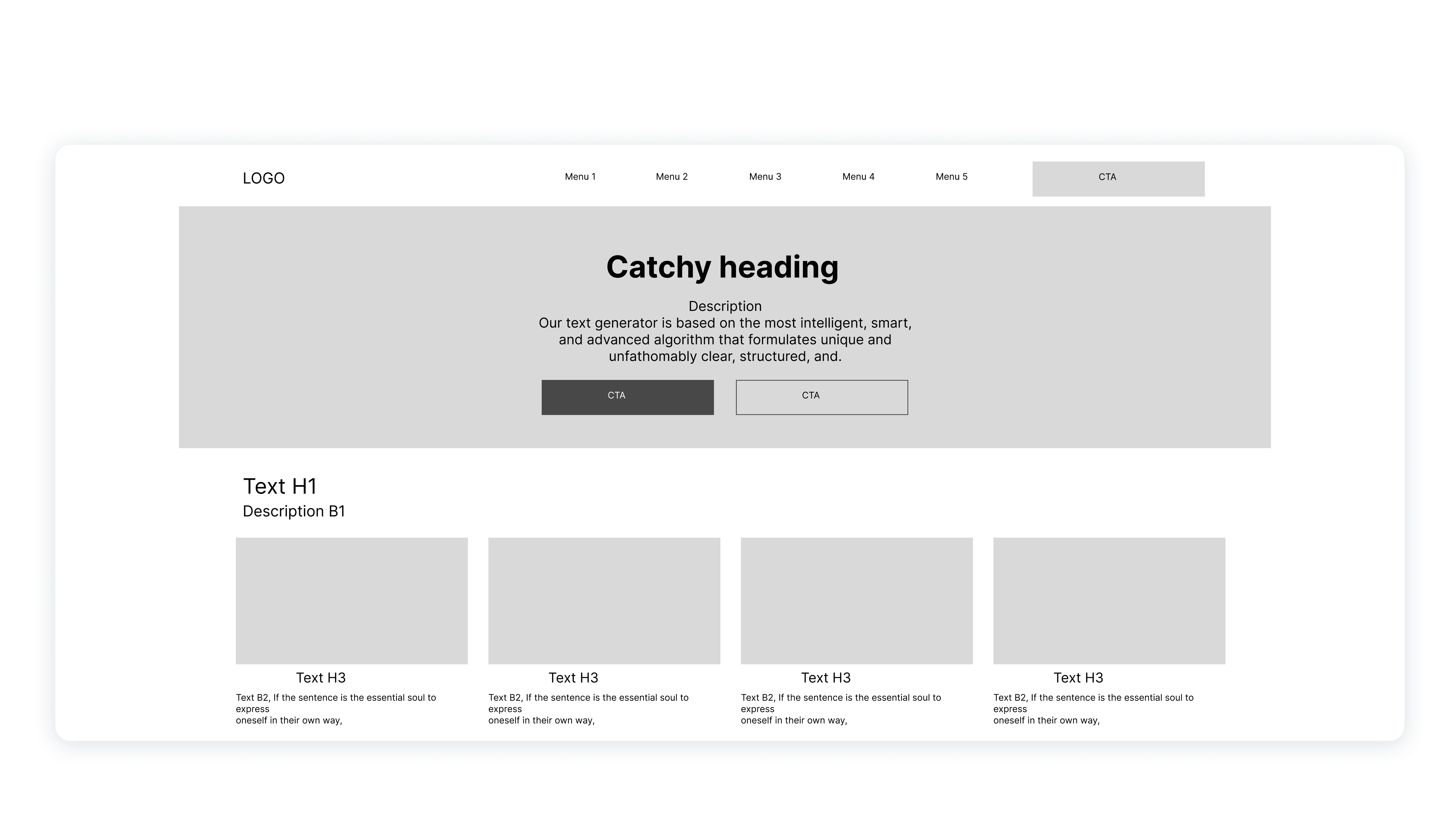
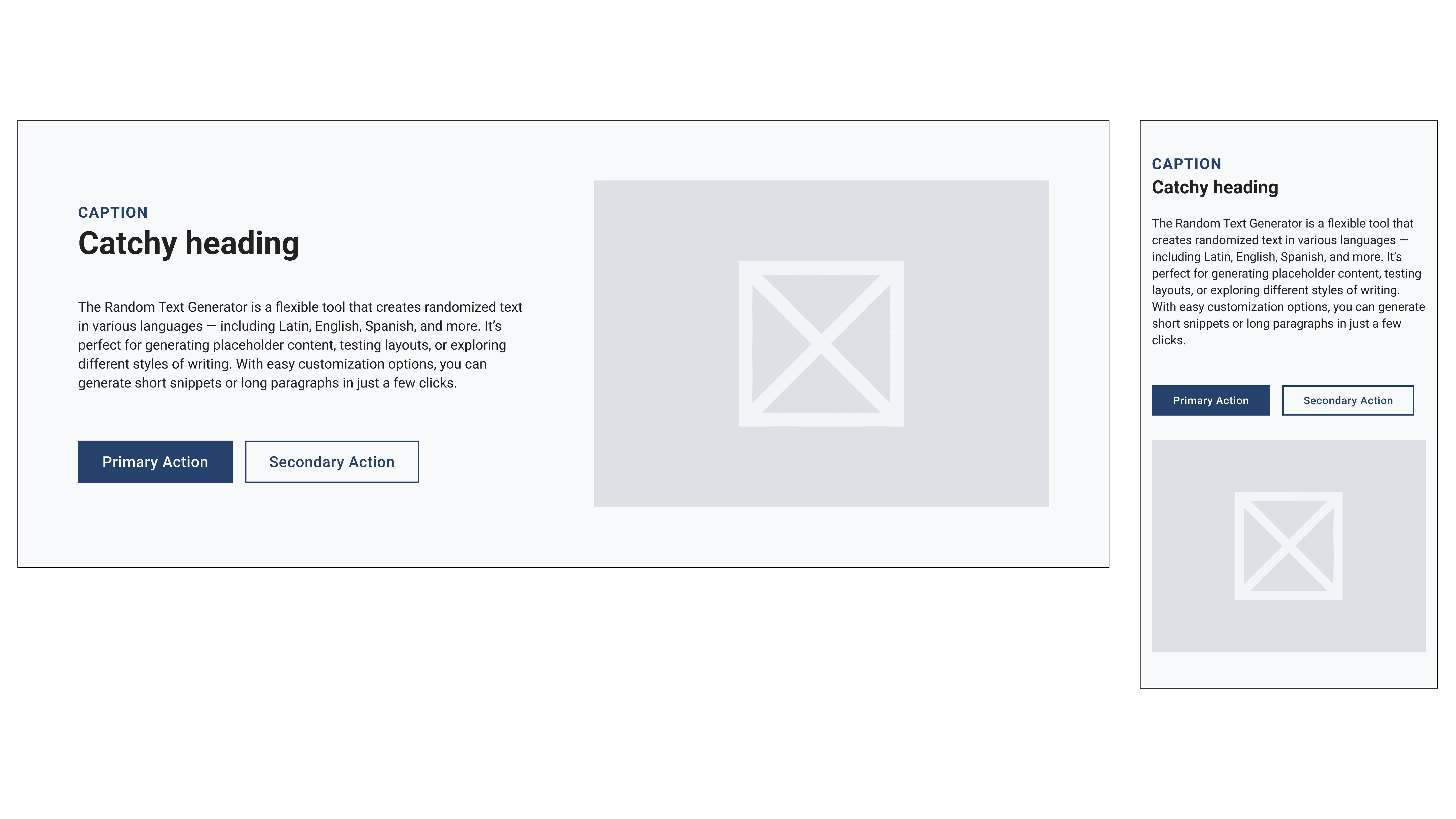
Style Guide
Wireframes
Prototypes
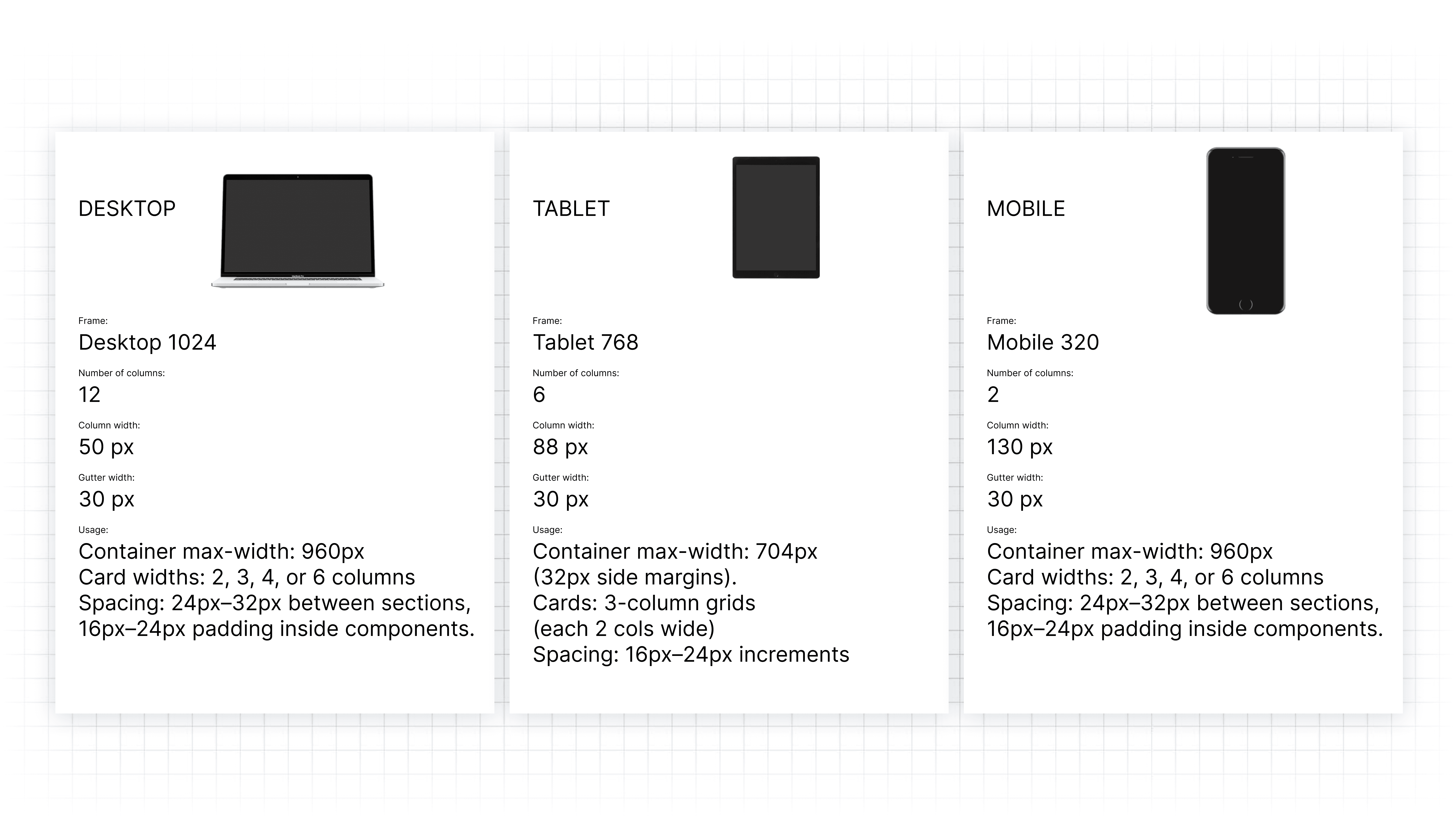
Style Guide
Colour scheme
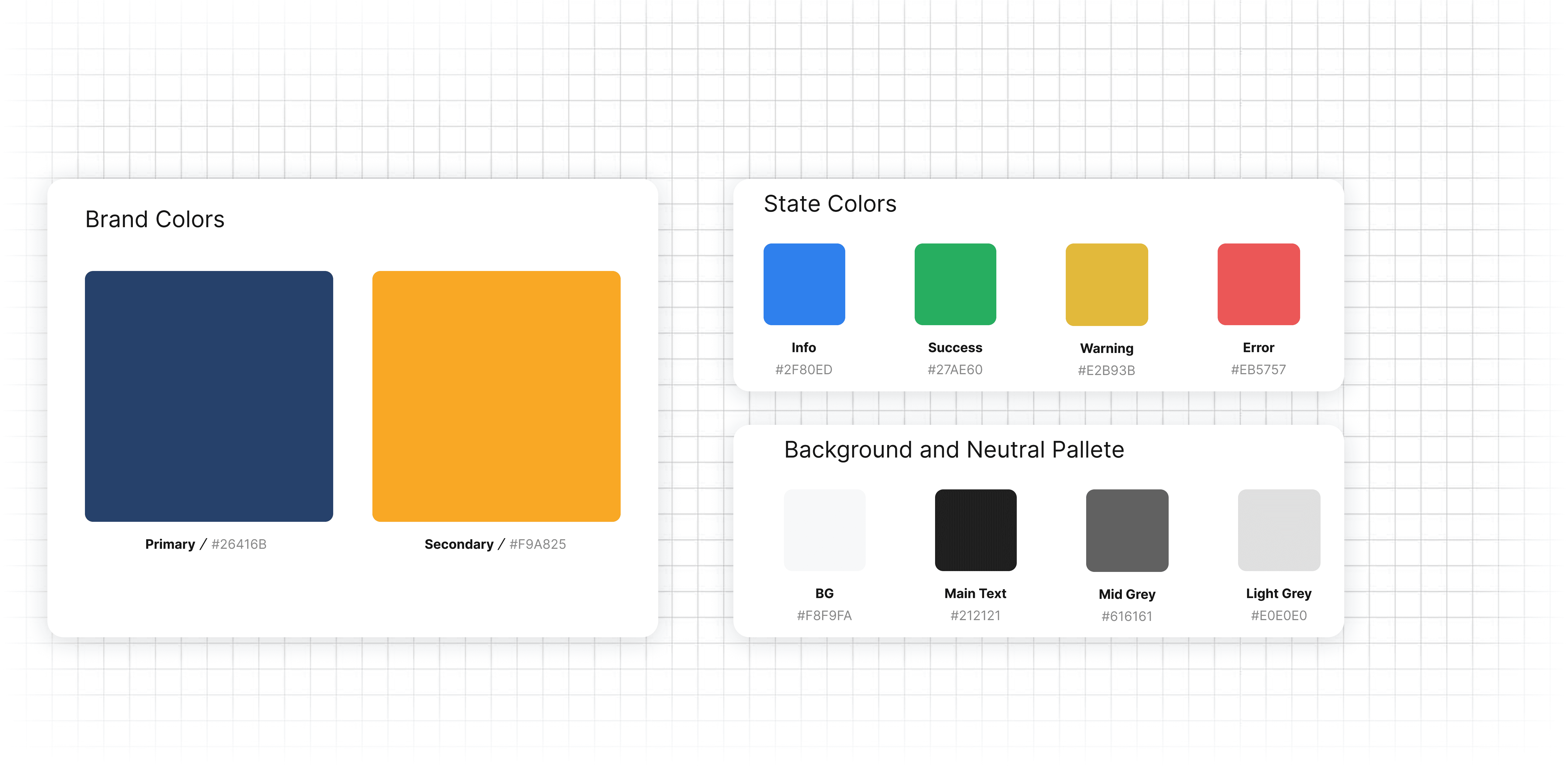
Typography
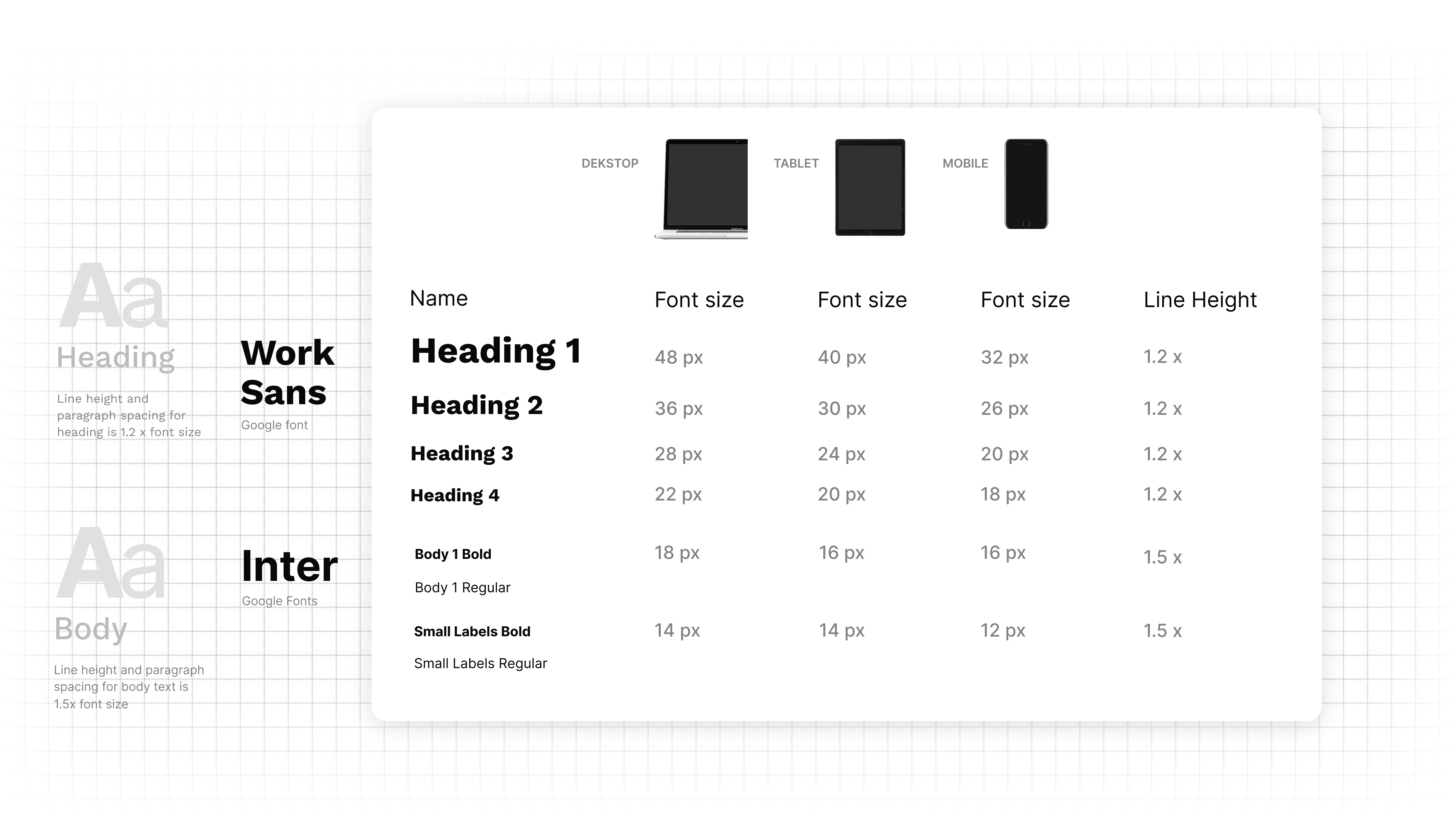
Grid System
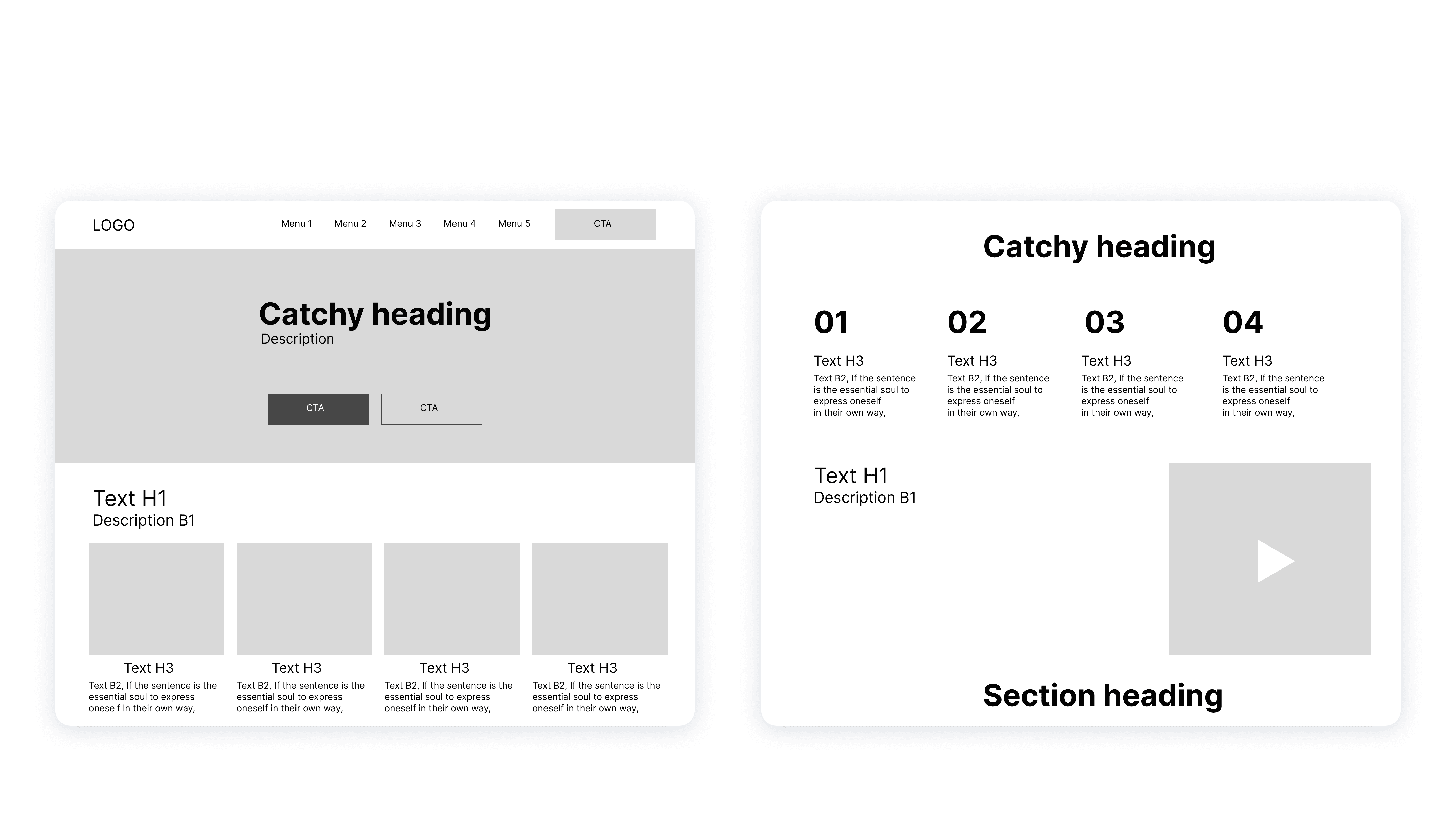
Wireframes
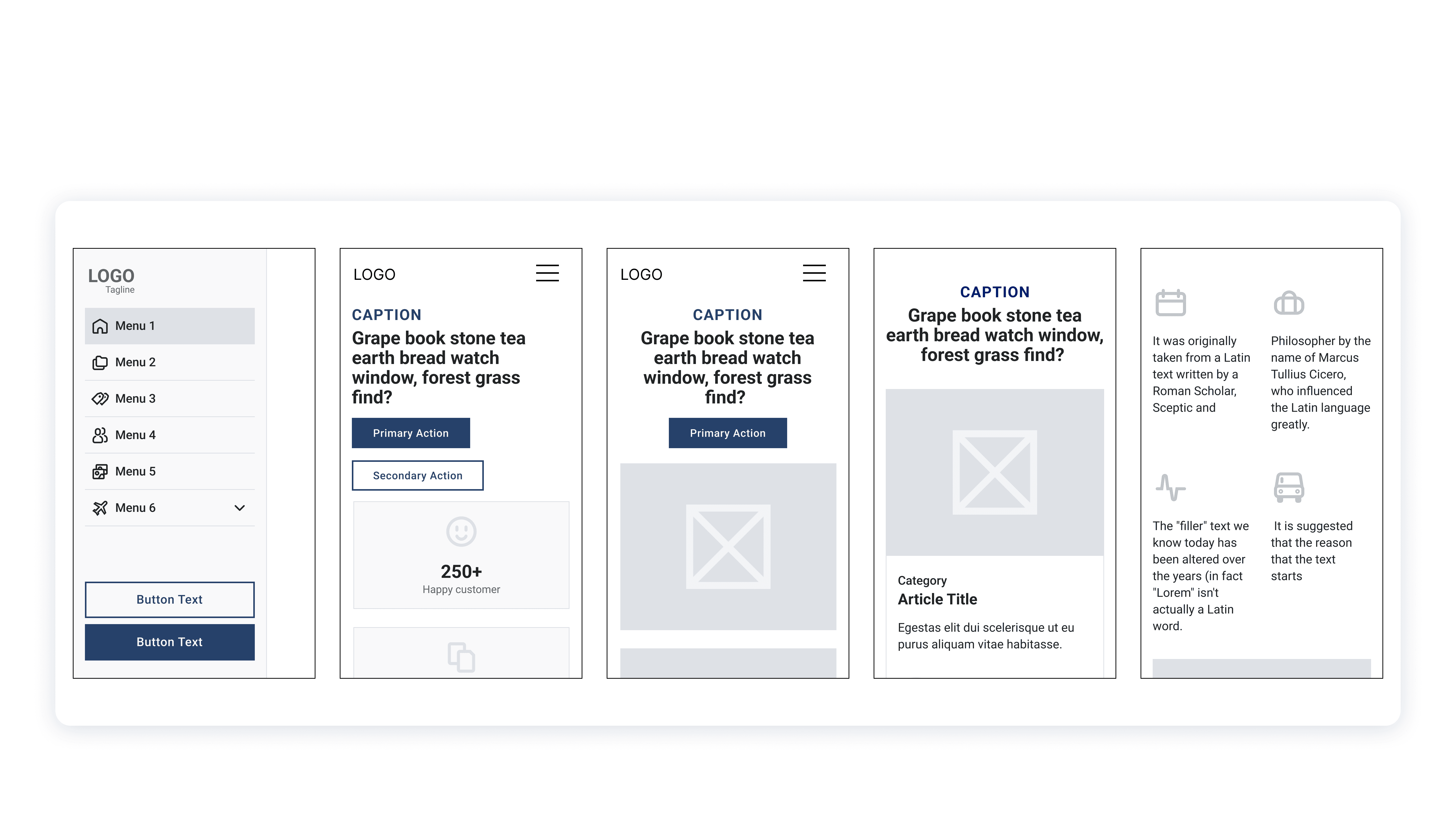
Physical Touchpoints Ideation
Digitally Staffed Help Kiosks
→ Placed in marriage registration offices, these kiosks allow users (especially those less comfortable with technology) to get assisted help for filling forms, uploading documents, and tracking applications using a tablet or touchscreen device with staff support nearby.
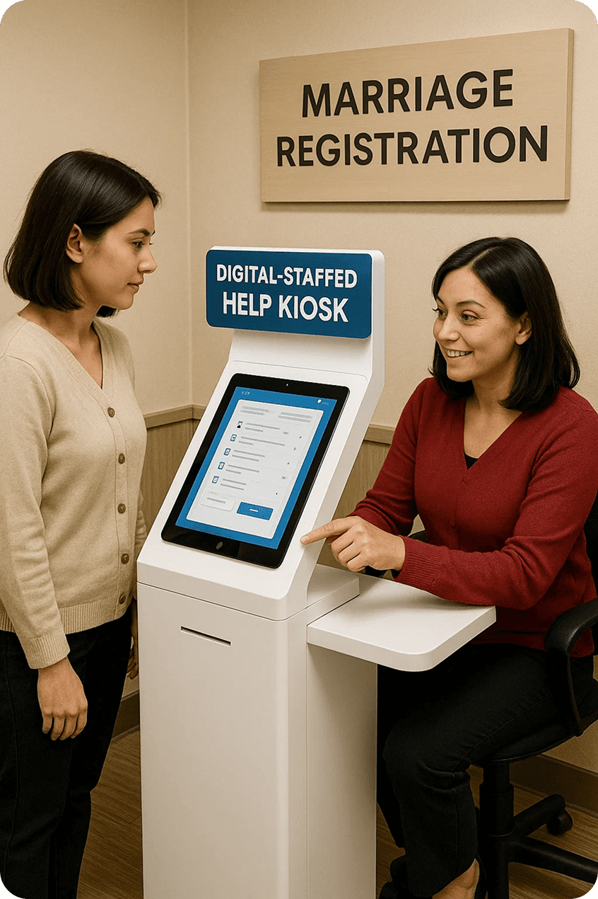
AI Generated images
Printed Legal Guidebooks & Checklists
→ Distribute easy-to-understand printed booklets that explain marriage eligibility, document requirements, and the timeline to offline users visiting offices.
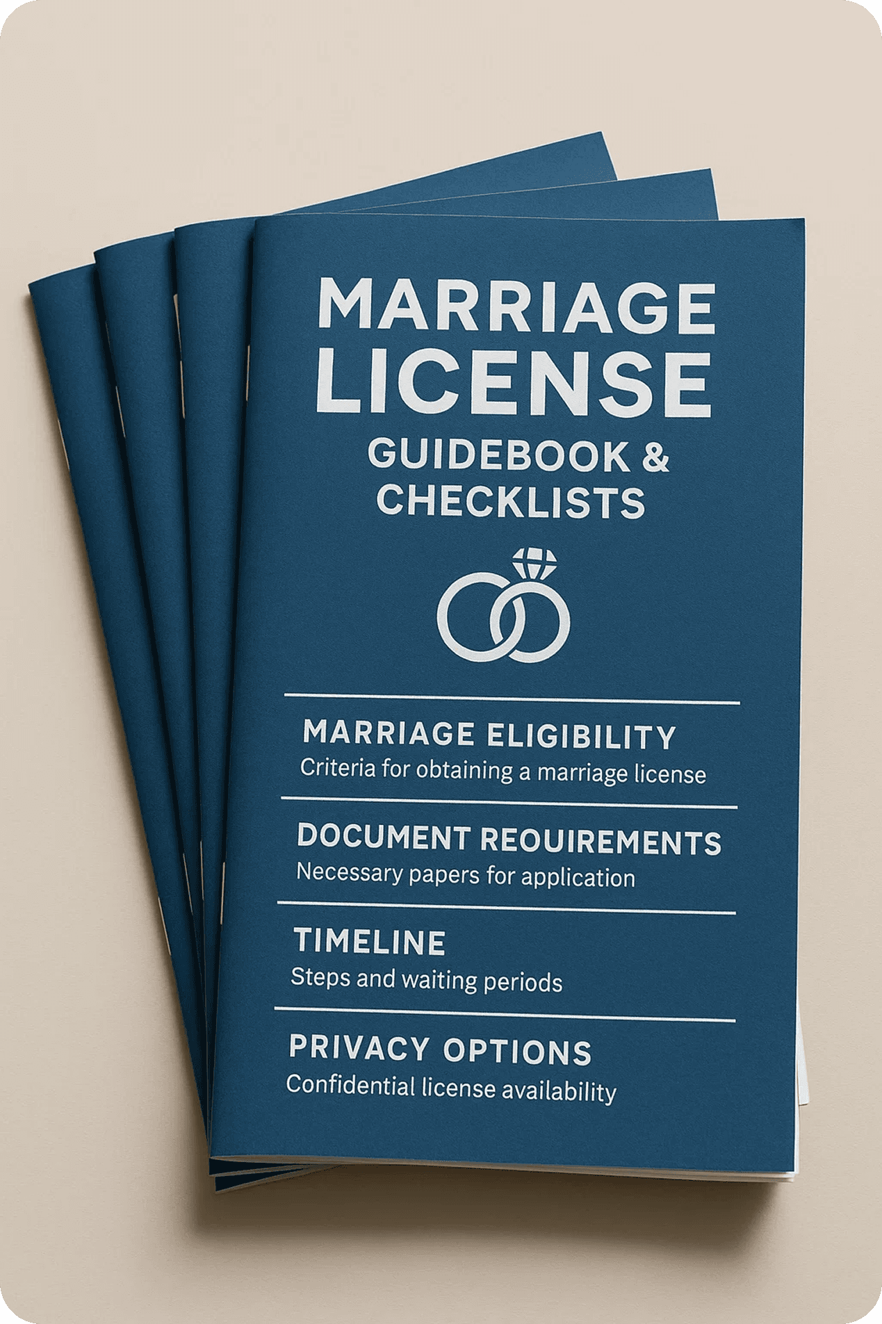
AI Generated images
Onsite Printing Stations
→ Dedicated counters for immediate printing of forms, receipts, and certificates to help users without digital access or printers at home.
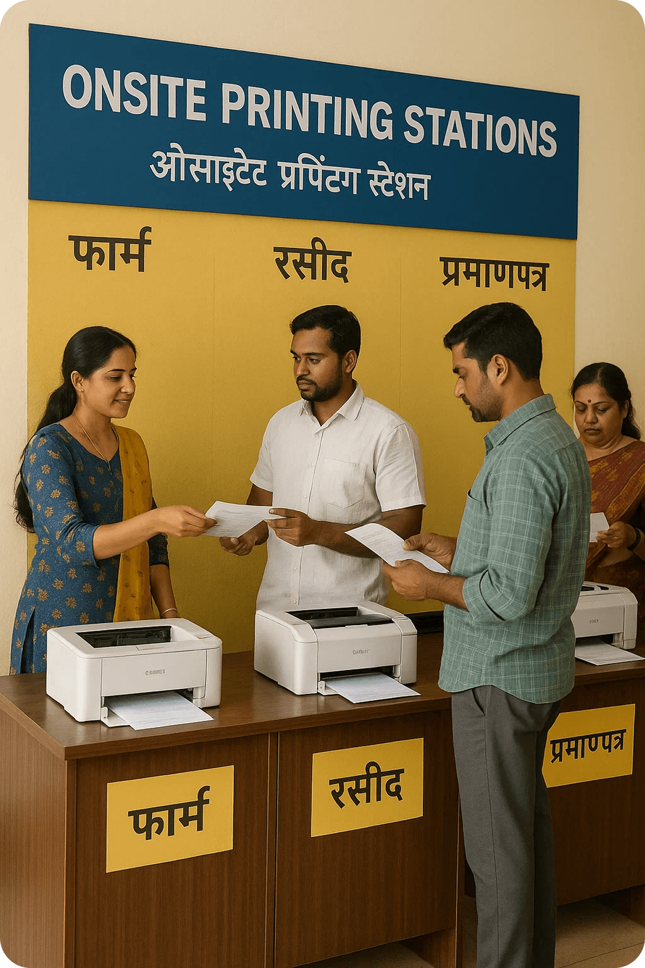
AI Generated images
Queue Management Screens
→ Digital displays in offices showing queue status in real-time, reducing uncertainty and perceived wait time.
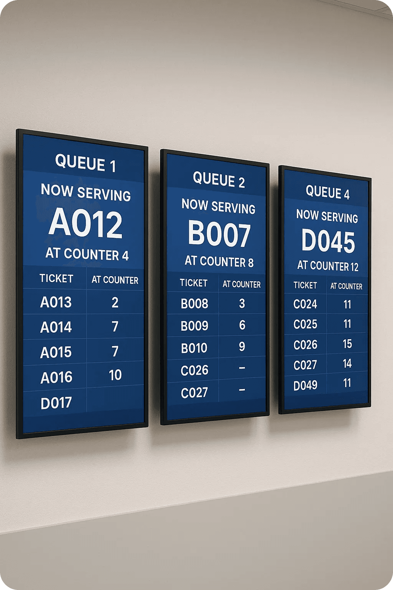
AI Generated images
Prototypes

Click to interact with Prototype

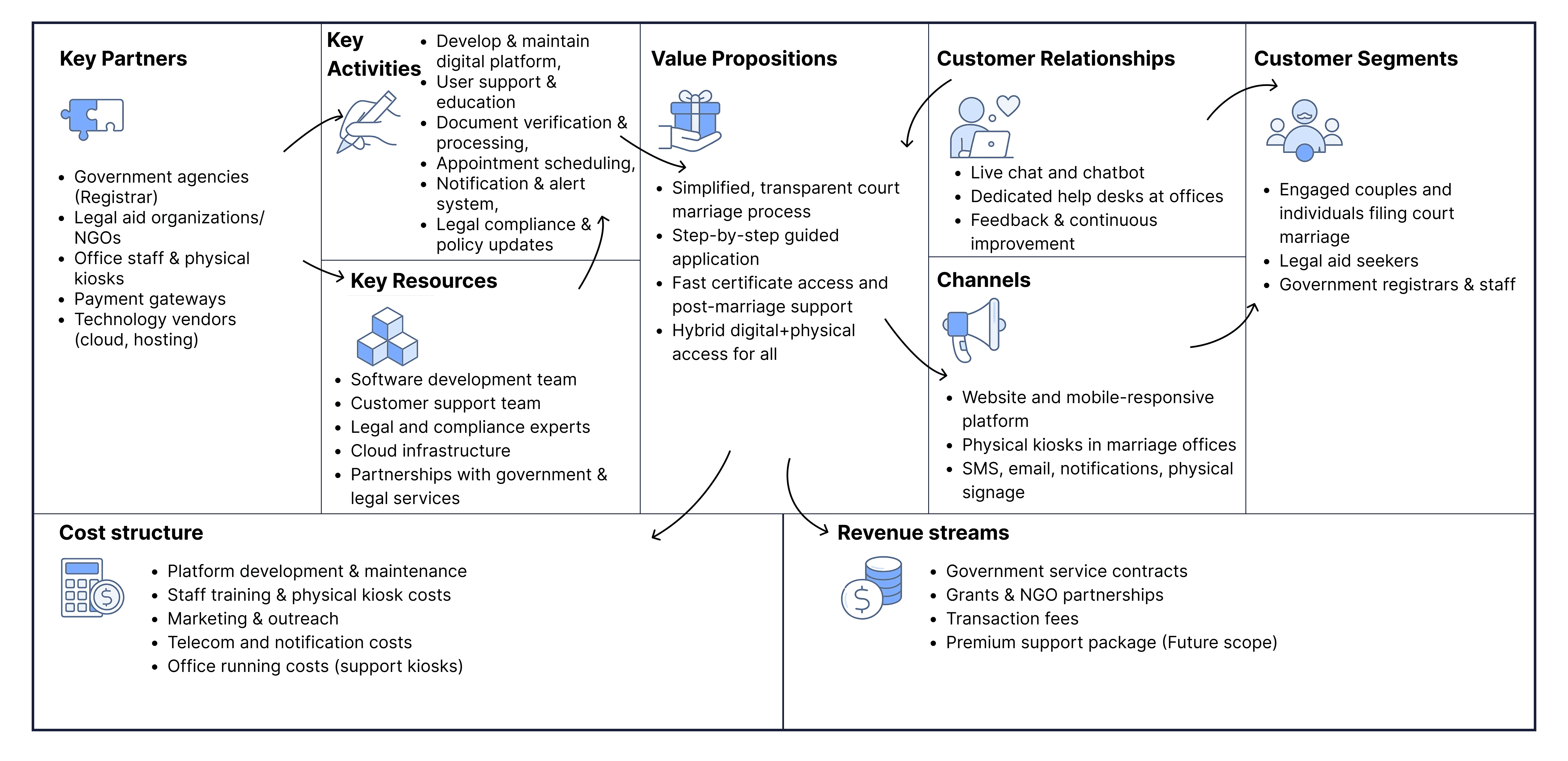
Business Canvas Model
Learnings
#1 User-Centered Approach Bridged Gaps Between Complex Regulations & User Needs
The process revealed that involving actual users early and frequently, through interviews and surveys—helps identify pain points and aspirational improvements.
#2 Journey and Service Mapping Unveiled Hidden Pain Points and Opportunities
Creating detailed journey maps highlighted inefficiencies and emotional triggers that aren’t obvious through raw data alone. It emphasized the importance of visualizing end-to-end experiences, revealing opportunities to introduce touchpoints that foster trust and reduce anxiety, such as physical support points or clear digital guidance.
#3 Iterative Prototyping Fueled by Continuous Feedback Accelerates Refinement
The design process demonstrated that rapid prototyping and frequent user testing lead to more usable, accessible solutions.
In this section
Usability Test Objectives & Background
Defining Tasks
Usability Test Plan
Methodology
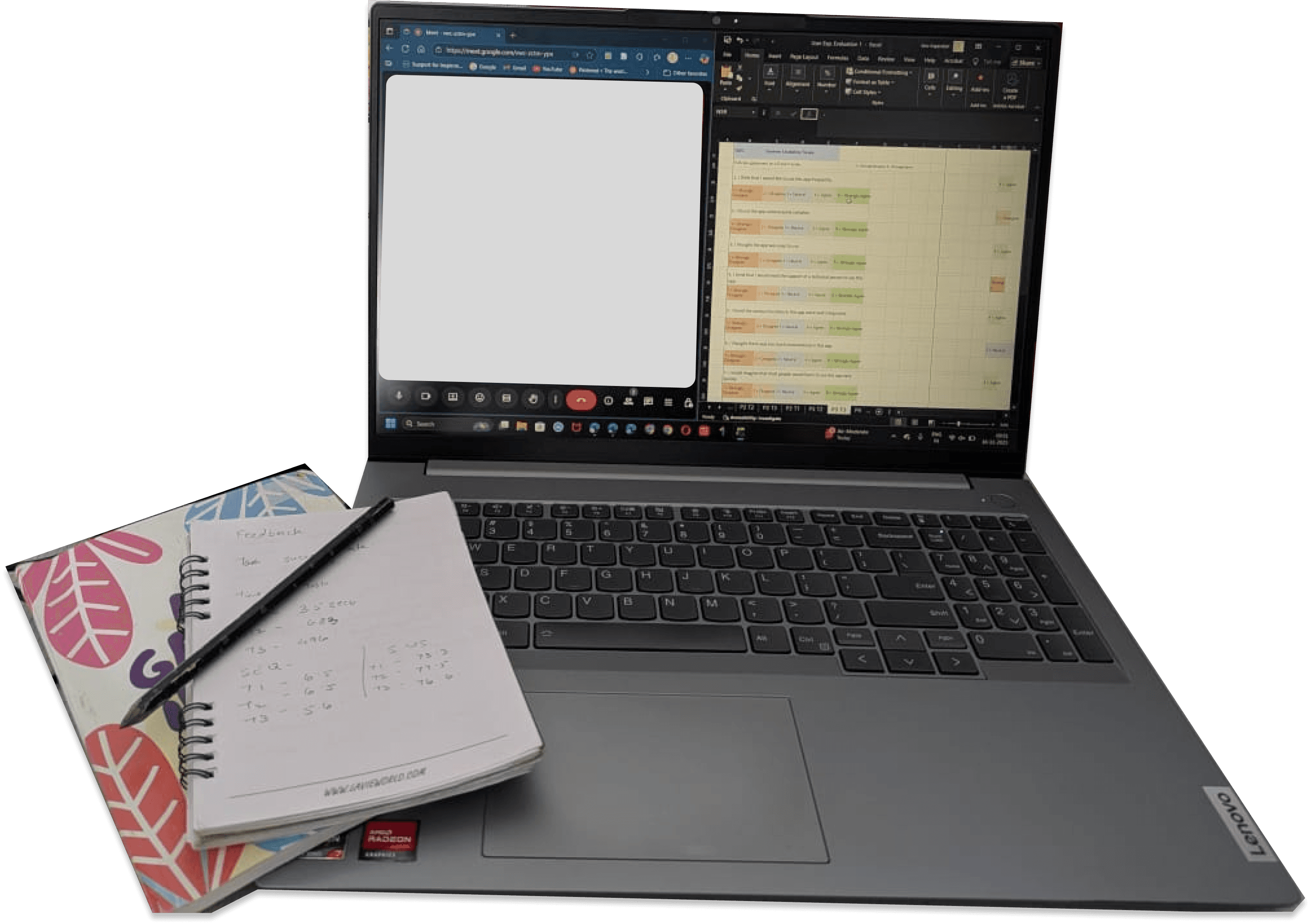
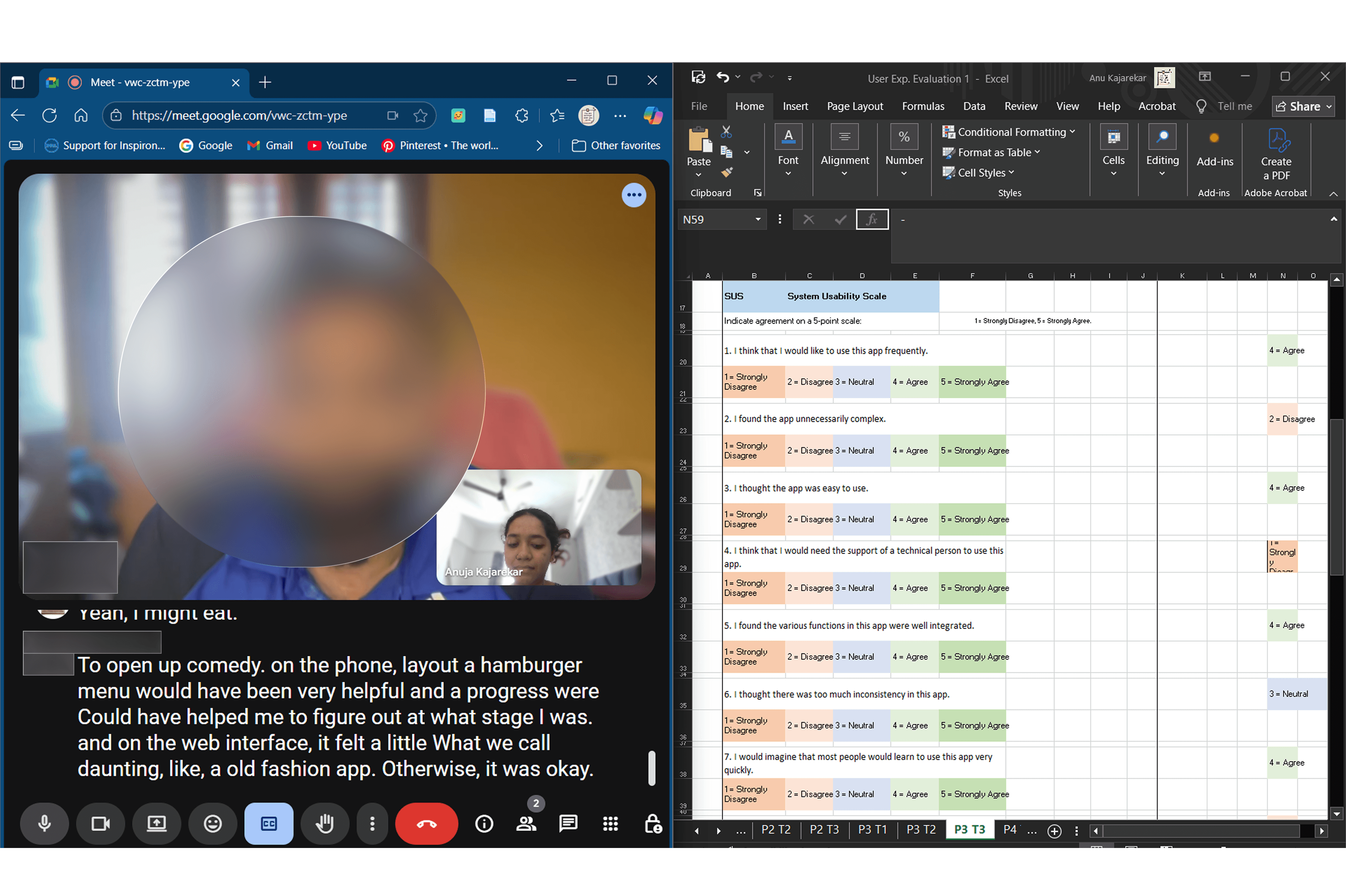
Complete Usability Test Recorded Documents
Analysis
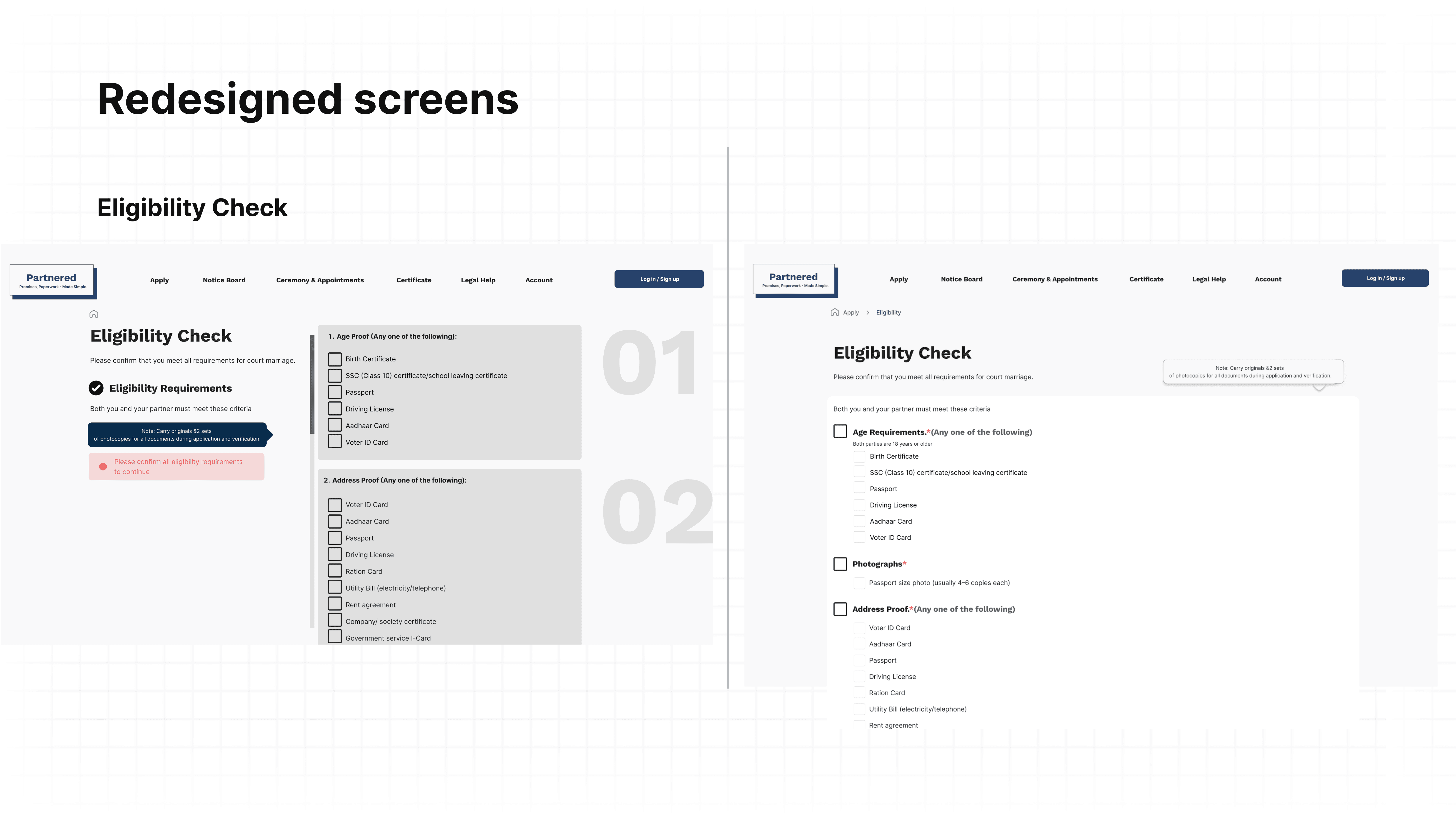
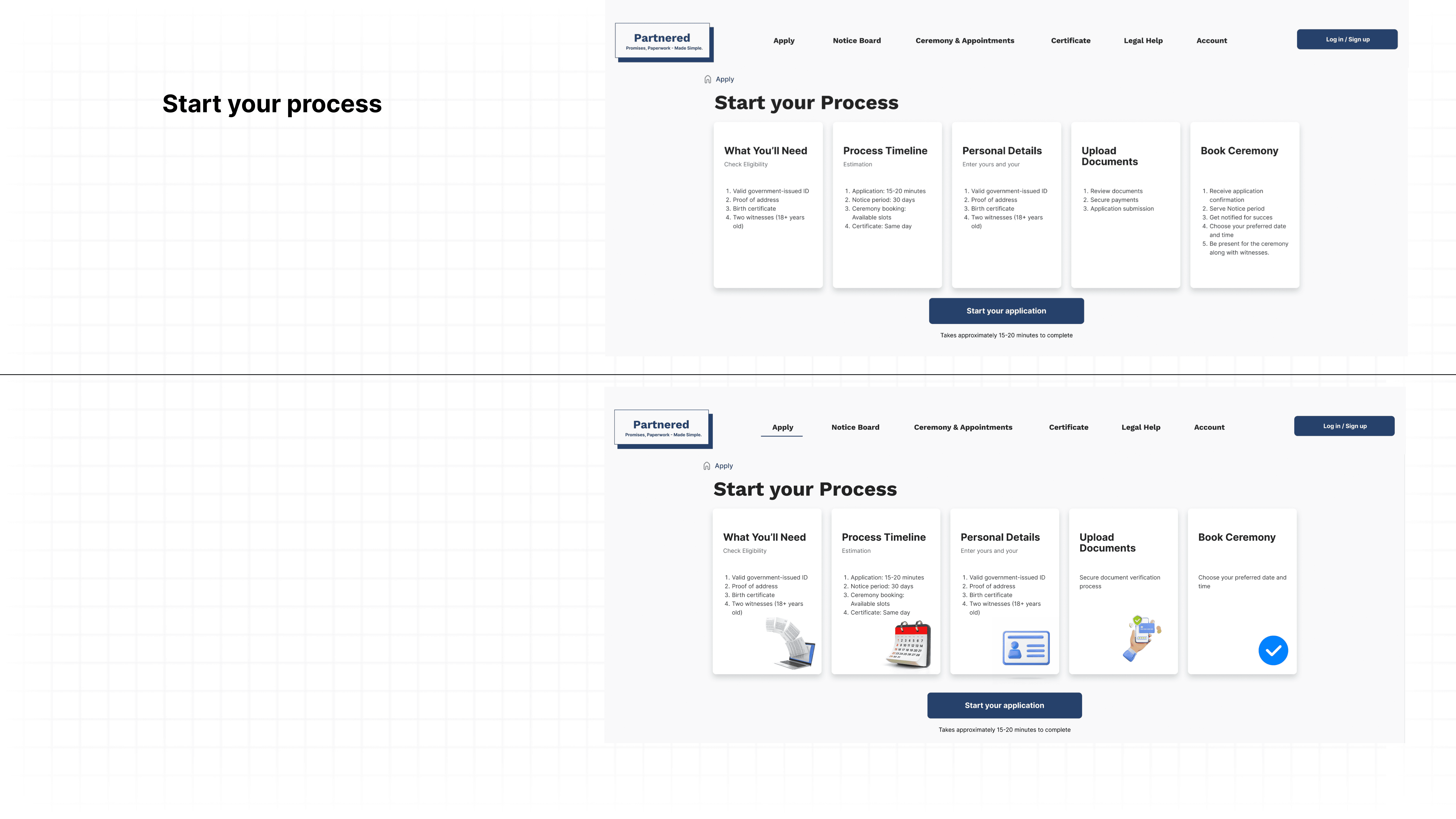
Redesigned Improvements
Test Objectives & Background
Purpose
Evaluate the clarity, efficiency, and inclusivity of the onboarding experience and document upload process for users registering a marriage online.
Identify usability barriers for first-time users at each step of eligibility check, personal and witness information entry, checklist navigation, and upload flow.
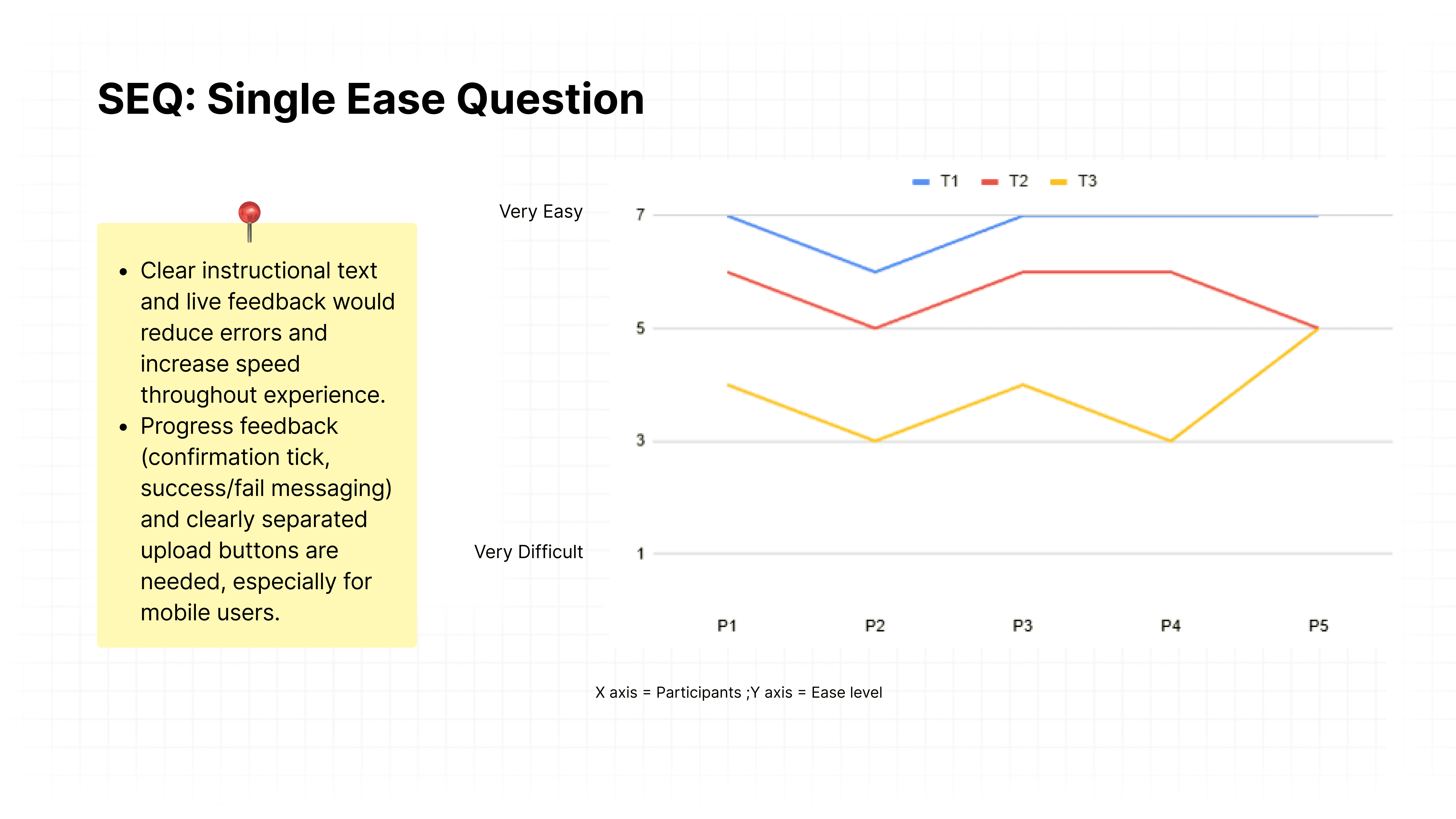
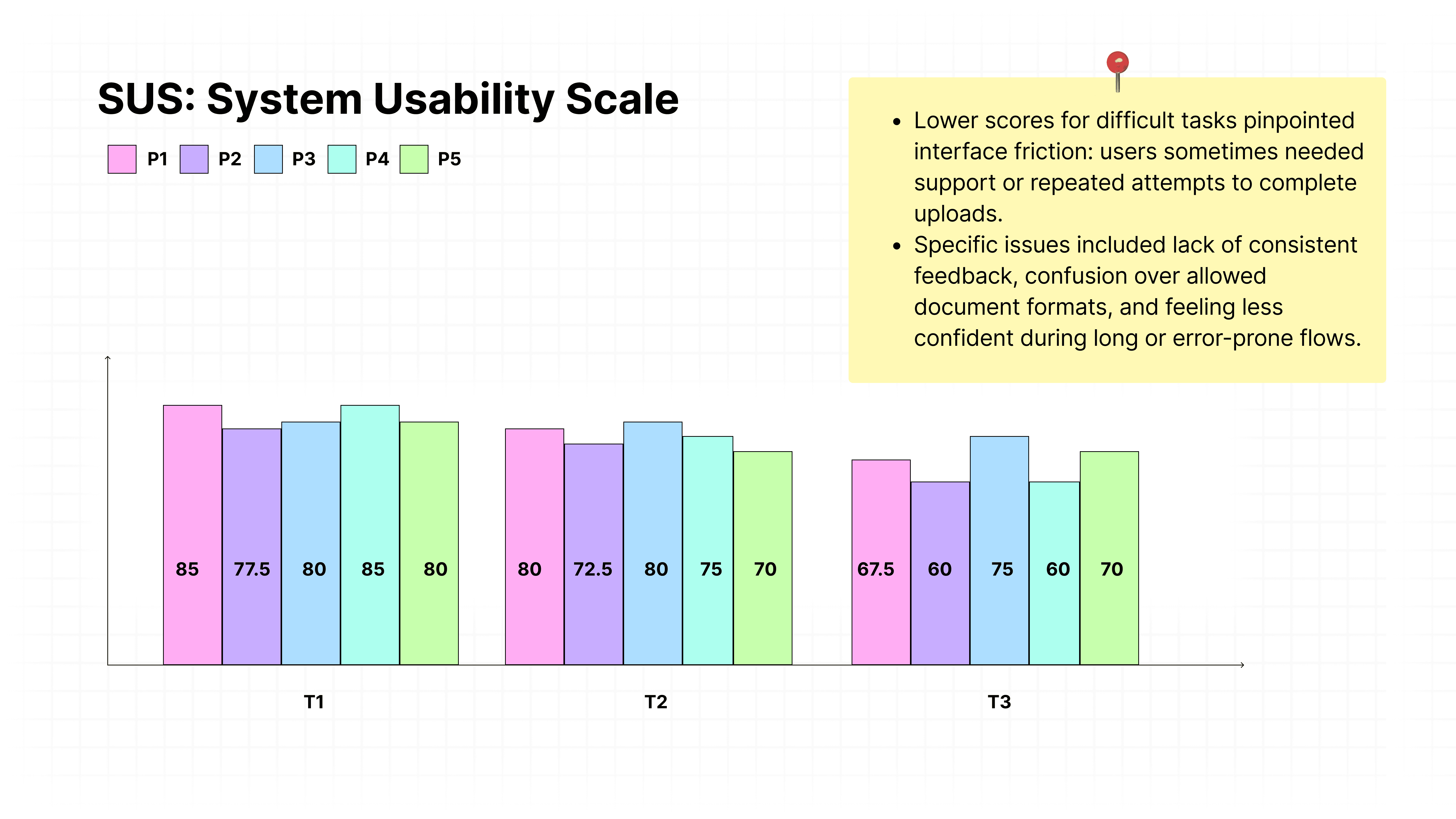
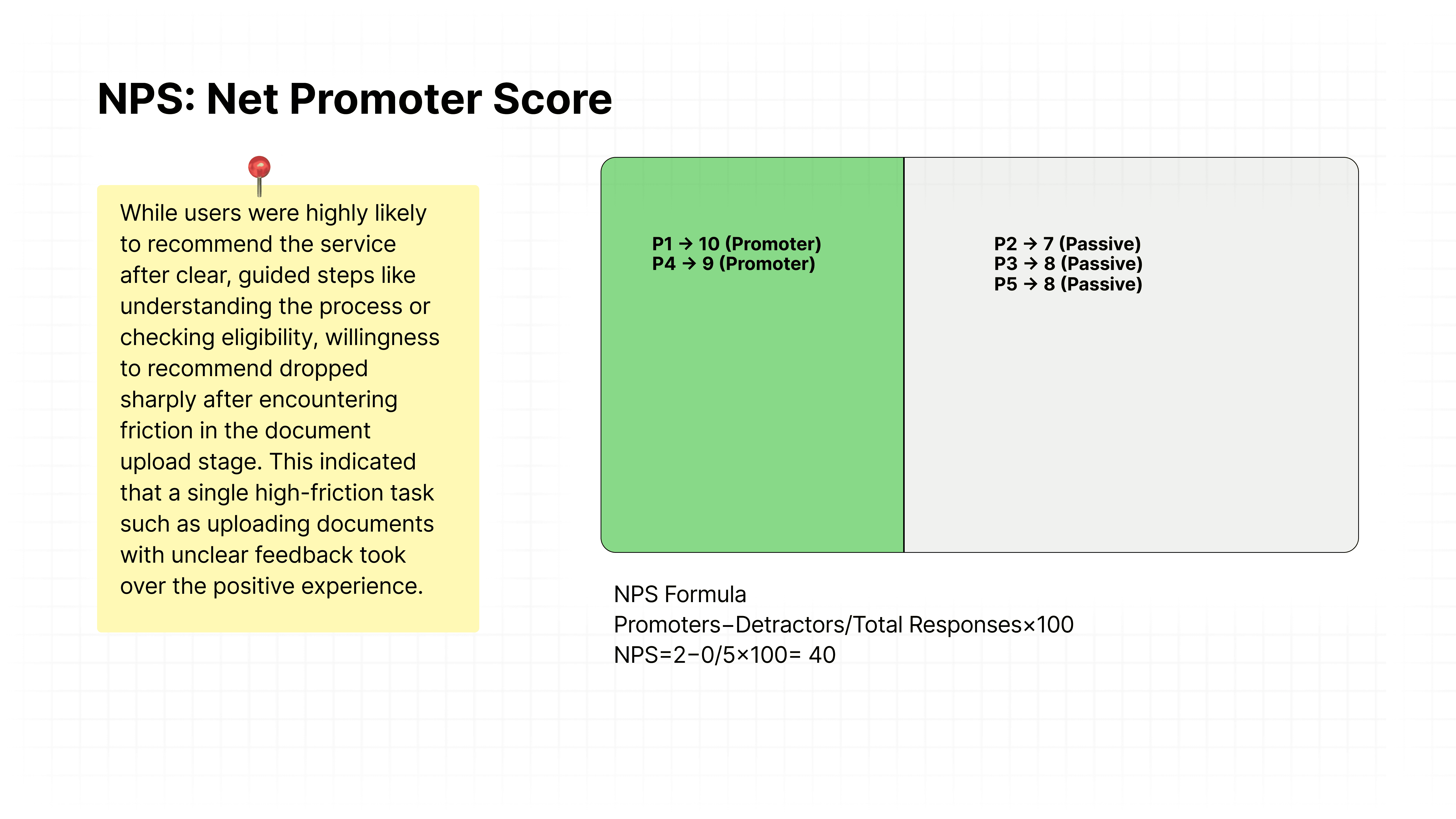
Gather quantitative (SUS, SEQ, NPS) and qualitative insights to inform design improvements for desktop and mobile platforms.
Test Objectives & Background
Scope
Screens reviewed:
Home/onboarding
Start application/process overview
Eligibility check
Personal details
Partner details
Witness details
Document checklist
Document upload
Status and updates (where applicable)
User tasks covered:
Begin application, check eligibility, fill required forms, upload necessary documents, track application progress.
Target Users
Adults ages 25–35 seeking official court marriage registration in India.
Demographics: Mix of students and young professionals in urban households.
Experience level: Moderate digital skills (comfortable with basic web/apps but not advanced users).
Device use: Primarily web/desktop with some mobile screens.
Motivations: Want a simple, secure, jargon-free guided process.
Background: Need accessibility and plain language due to legal complexity; potentially multilingual and requiring clear instructions for legal terms and documentation.
Usability Test Plan
Pre Test Preparation:
1.1. Moderator script
1.2. Consent form
1.3. Set up
1.4. Pilot testDuring Test:
2.1. Welcome, consent, intro, think-aloud.
2.2. Pre-test questionnaire (demographics, prior experience).
2.3. Task briefing, actual task runs.
2.4. Collection of metrics (time on task, errors, success/failure) and think-aloud notes.
2.5. Administer SEQ and SUS after each task.Post Test:
3.1. Post-task questions (debrief, open-ended feedback).
3.2. Net Promoter Score (NPS).
3.3. Acknowledgment and Regards.
For detailed document check out: Usability Testing - Google Docs
Usability Test Readings
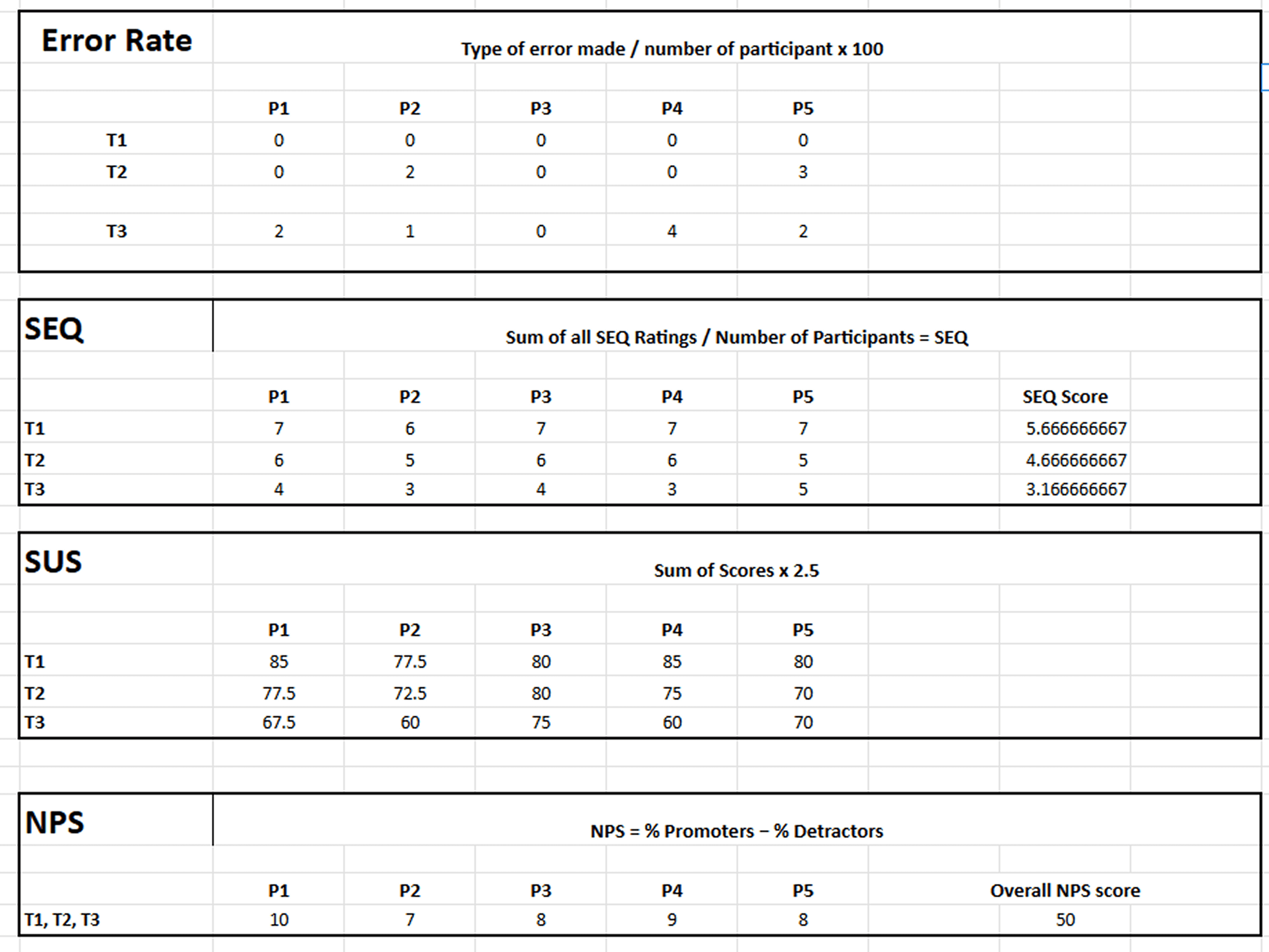
For detailed readings check out: Usability Test Evaluation - Google Sheets
User Quotes Highlighting Key Issues
"Wasn’t clear if my PDF was accepted or not - there was only a pending message that didn’t update."
"Would be much easier if there was a ‘Success!’ popup each time I finished a document."
"I was nervous I’d miss a requirement because the form didn’t flag missing fields until the end."
Analysis
Users consistently found the initial process flow clear, benefiting from visual indicators and step-by-step breakdowns.
The document checklist was broadly helpful, but lacked visual examples while looking overwhelming.
Real-time feedback and confirmation messages were missing during uploads, resulting in user uncertainty and undermining satisfaction.
Accessibility accommodations and support links during error-prone tasks were requested by participants, especially those with lower digital skills.
Mobile interactions suffered from unclear button labeling and ineffective drag-and-drop, prompting requests for a more “tap-friendly” design.
Improvements
Issue | Severity | Frequency | Improvement |
|---|---|---|---|
Confusing file upload UI on mobile | High | 3/5 | Modal feedback, simplify upload with clear buttons |
Unclear terminology | Medium | 1/5 | Add tooltips for simple English explanations |
Weak feedback on error states | High | 4/5 | Make error prompts more prominent and specific |
Add progress bar | High | 5/5 | To track user’s location, et of completion and not to miss any crucial step |